Written by Bertrand Théaud, Statrys Founder
20+ years in Asia as a corporate lawyer, investor, and fintech founder. I've sat on both sides of the table and seen the same avoidable mistakes hit founders again and again. The reviews and articles I write are for founders who'd rather skip the mistakes.
Last reviewed January 2026.
It's about time for a makeover.
Don't worry, all the things you love about Statrys are staying the same, including our easy-to-pronounce name, as well as our mission and values.
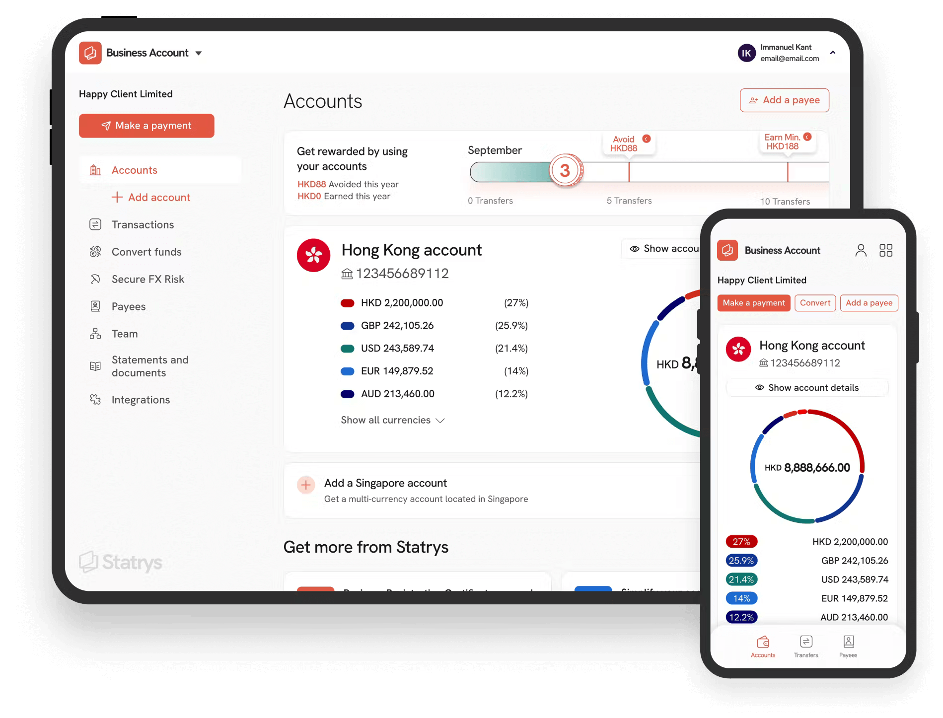
Statrys is getting a brand new look: a new identity to reflect the dynamic environment digital payments can expect in the future, a new symbol easier to recognize, a color scheme that defends our values, a better user experience, and a bunch of really cool new services!
It's a new era for Statrys, and for you that join us on our path.
In with the new
No doubt you've already seen the changes on our website since you're on it right now. This is just one of many things that have been updated and upgraded with our new style.
Here's what you might notice:
A new symbol — clear and dynamic

Payments are at the very core of our business, and crucial for yours. Powering transactions across the globe makes us proud, especially when we do it with a level of transparency that only serves to benefit our customers. Our clients make us proud. Opening up new possibilities for small businesses makes us prouder. We wanted a symbol that reflects our attitude.
Have a look. What does it mean to you? A lighting bolt? A folding wallet? You name it. It's a symbol as easy to recognize as the payments underdog we are.
New typography — human, to the point

We want to communicate in a direct voice. Human to human. Straight to the point.
This is how we believe businesses should act, dress, and talk. We've selected different typography to reflect that attitude, and as our business has sprung out from the heart of Hong Kong, we will be talking from now on using the typography HK Grotesk. A clean-shaped, simple and powerful font, just as we want to be.
Color Scheme — through balance comes clarity

To reinforce all that's we've built together, our voice, and our symbol, we have updated our color scheme to bring a better balance to that effort. A focus on bringing clarity and transparency to your experiences.
Our color scheme balances now in primarily white, highlighting where it matters, keeping it soft when decisions are being made. The best argument is not the one with the loudest voice. We want to be blunt, we want to be direct, but we also don't need to scream.
New Illustrations - Worth a 1000 words

Some of the concepts involved in payments, fees, and generally the whole banking experience can be difficult to explain, yet easy to show. A new family of characters has come to Statrys to help us explain and, ehem, illustrate how we want to bring change to payments and fintech in general. Clean shapes, rounded heads, dynamic and inclusive, the new family is here to stay. Like in the picture here above, Jenn just helped our client Tom make a successful payment for the first time. High 5, Tom.
Why the change?
We've taken a step back and had a long look at ourselves. For the past two years, we've been helping small businesses across the world make payments via our multi-currency business account.
And business is good.
Our clients get their payments where they need to go.
But is that enough?
At Statrys we don't want to be just an alternative to traditional banking.
We also don't want to be just another flashy fintech that prioritizes tech over the human element of business payments.
We want to help you go pro.
This is what our new updated branding is here to do.
To humanize our business, so all clients feel like they're part of the journey - other SMEs growing alongside them.
What's next
How exactly are we growing with clients you ask?
We're improving not just the look at feel, but also the experience users have on our platform.
We're making things like applications, payments, and user management much easier and smarter. You'll notice the platform takes on a smoother, cleaner look that not only helps make it easier to review and manage your account but also reduces time and headaches when making all too important payments and trades.
New Mobile App
Statrys is going mobile
The Statrys mobile app is releasing with some limited features in the beginning, but we know your business is on the move. Our roadmap is set to bring the entire Statrys platform experience to your mobile device.
Insider Edge
Statrys is also set to launch our Insider Edge service, where our clients will finally be able to become a key part of their own payments and business account needs. With Insider Edge, clients can now take part in funds set aside for use to either direct our platform's development, invest in other clients' projects, and more. More details are coming about this new aspect of having a Statrys business account, so stay tuned.
Wrapping up
We're still the same Statrys. Well, a bit better now. We're kicking this soul-less, tech-driven fintech industry to the curb and focusing your experience being on a human-driven platform.
Like the new look?


